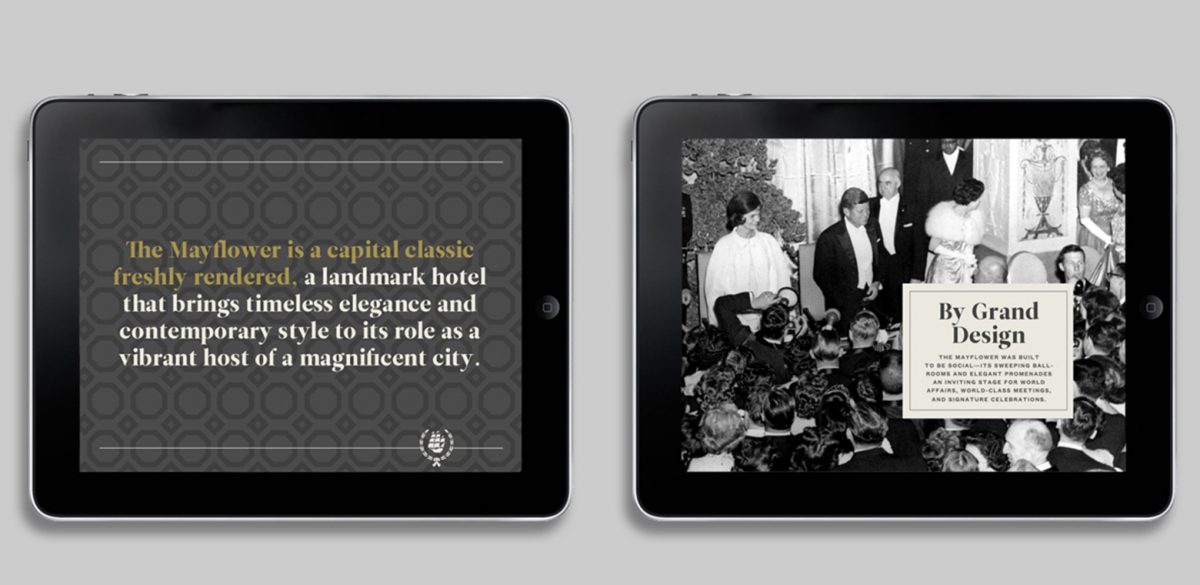
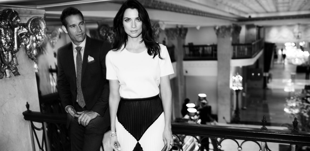
The Grande Dame Smiles Again
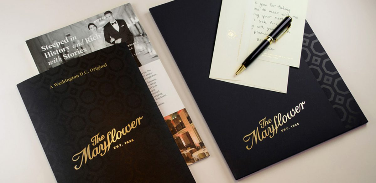
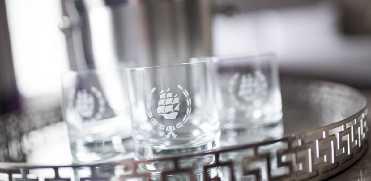
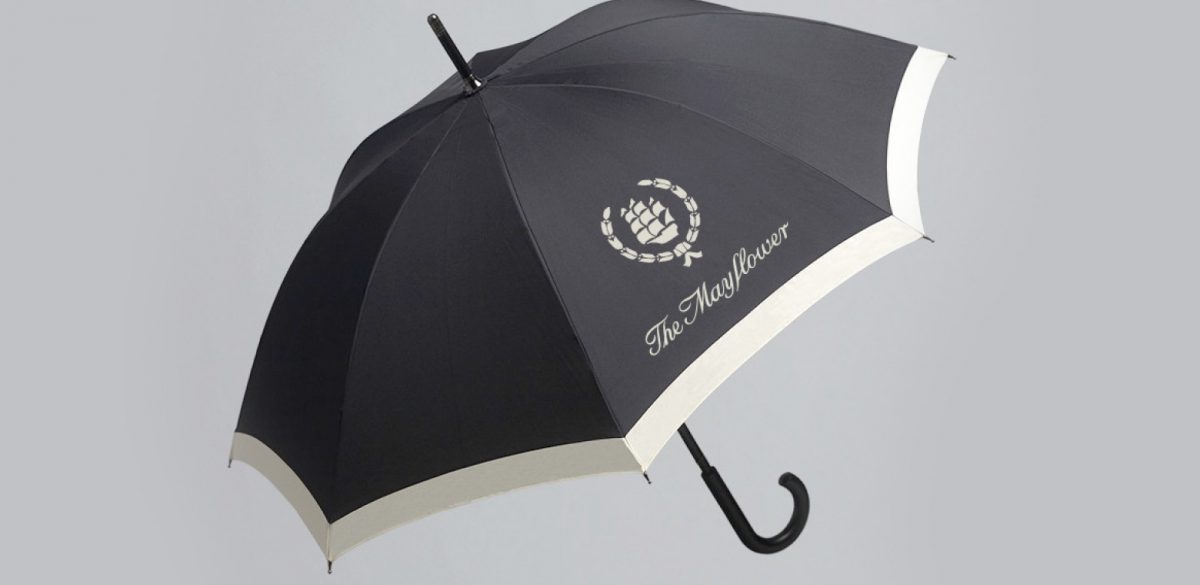
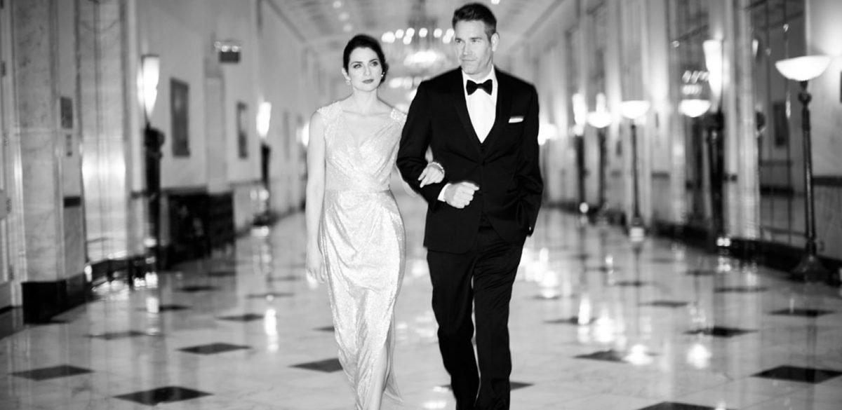
Tapping into the rich vein of its storied past and celebrating its proud heritage as an iconic historic destination, Korn recast The Mayflower as a vibrant and elegant social hub — restating its distinction as the capital city’s foremost host. The heart of this rebrand was less new invention and more a hale and hearty respect for the original identity and story of The Mayflower – a restoration of its soul, breathing life back into the always-destined-to-be independent lady.
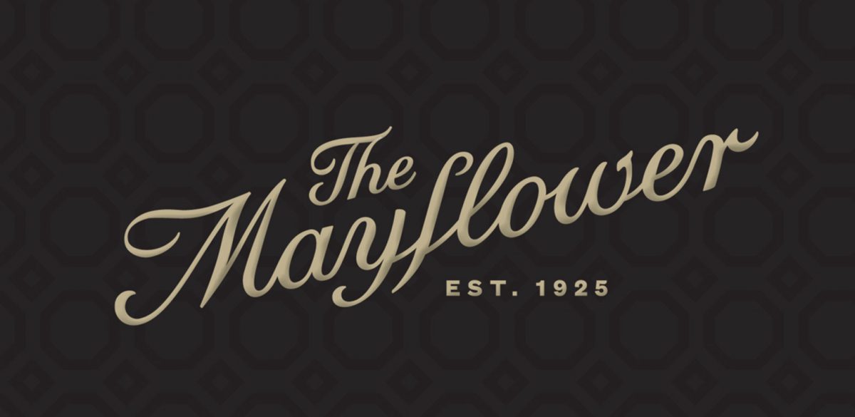
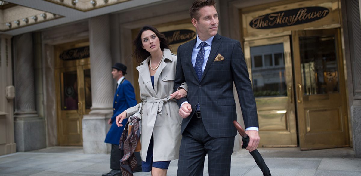
We commissioned type designer, Maggie Putnum, and former KORNStar, to redraw the original logotype and return the typography to its former grandeur. Using original signage and historic captures of the initial type treatment for reference, care was taken with each curve and accent, resulting in a new logotype that rests at a fresh upward angle, locked up with the EST. 1925 tagline.
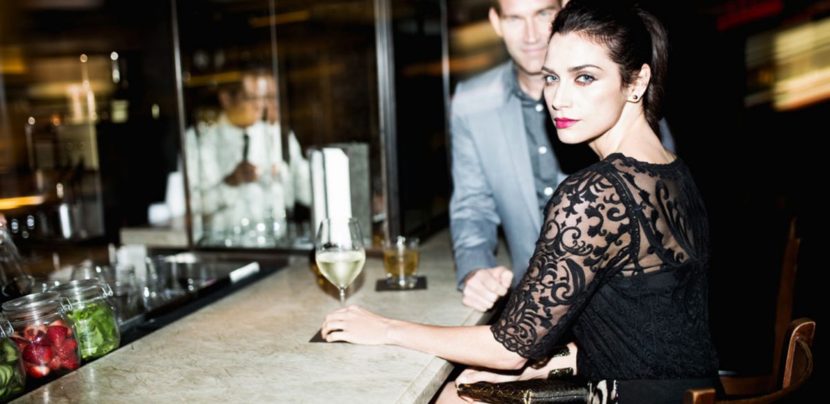
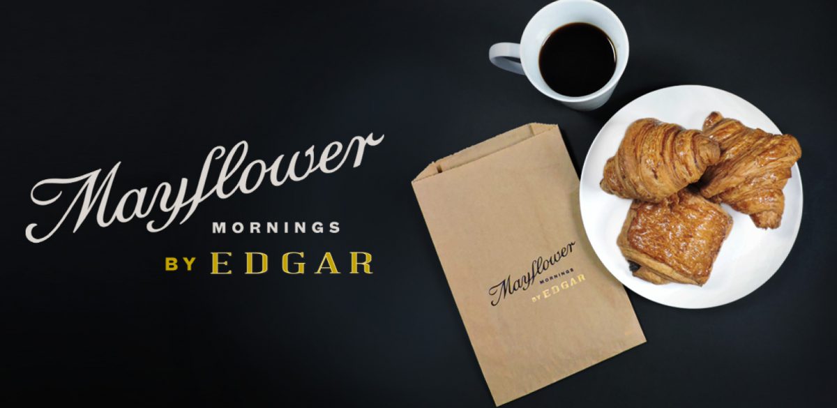
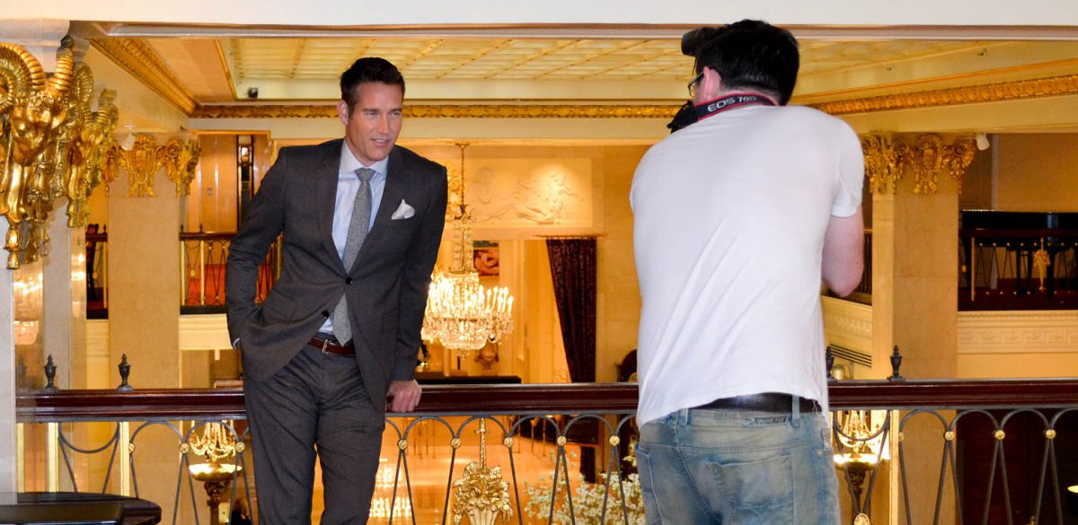
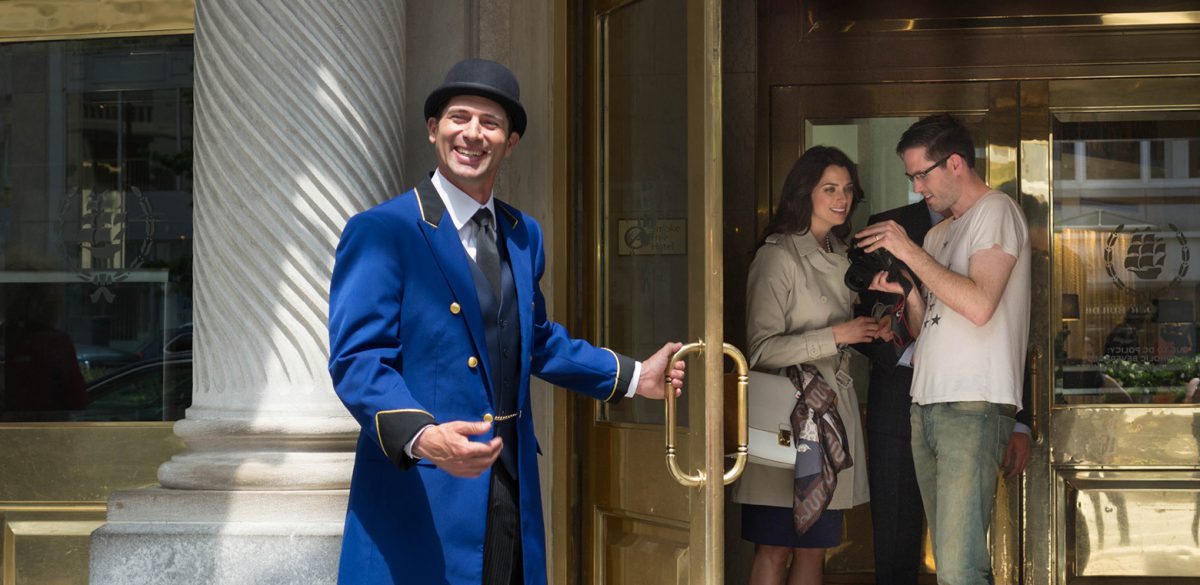
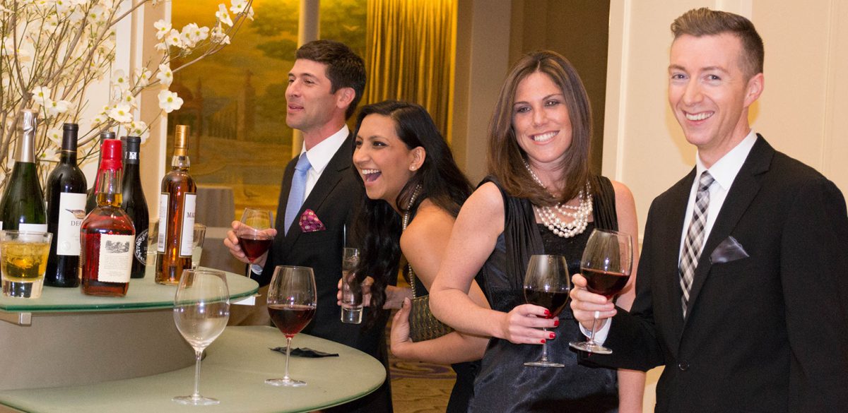
Through a plethora of activation strategies designed to bring the new brand to life, The Mayflower experience continues to unfold as only a true, “Washington DC Original” can.
We are excited to share 25 pivotal projects, partnerships and creative moments with you over the next six months. Subscribe to our Newsletter to get monthly updates of our 25 years of projects. Follow us on Instagram to see more behind the scenes at Korn over the last 25 years!