


Bedford
Bedford/St. Martin’s, a 30 year old publishing company, includes a passionate team of authors, editors, and educators dedicated to the highest level of excellence in the field of academic publishing.
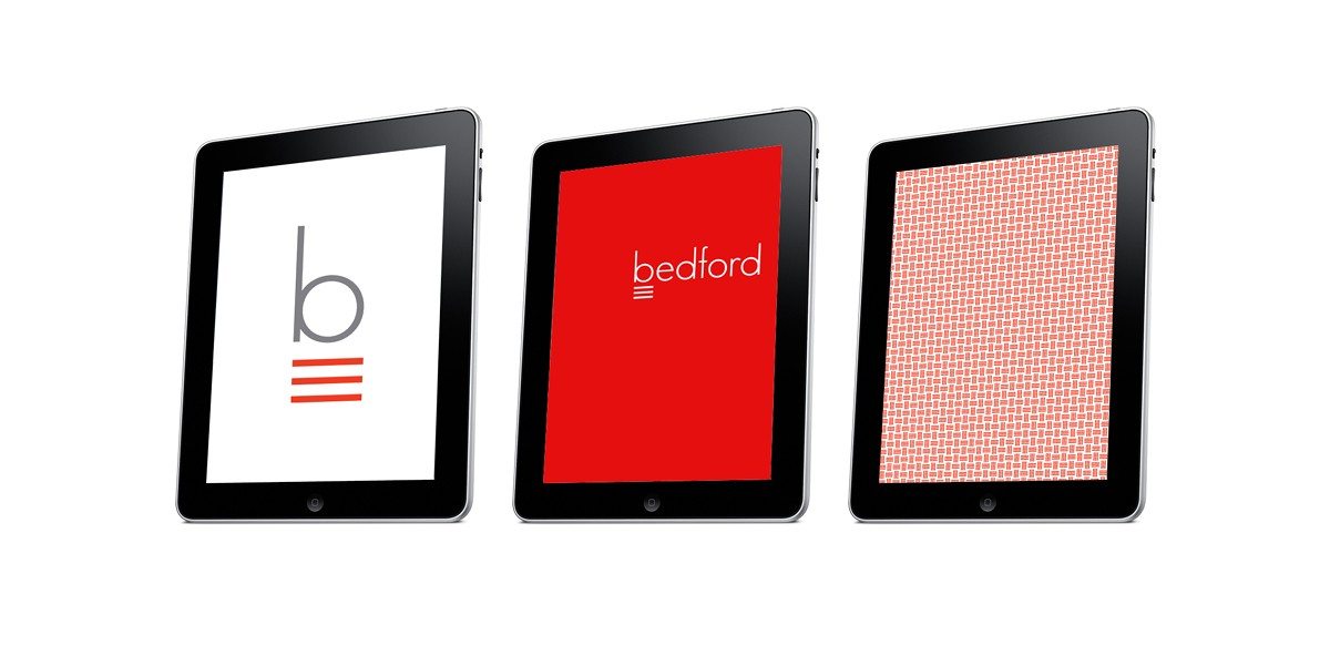
In developing the brand experience for Bedford/St. Martin’s, Korn Design built on the core values of rigor, creativity, innovation and accessibility to arrive at a strong, colorful, yet entirely modern visual solution to be reflected not only on their books but also in a growing number of digital products and professional resources.
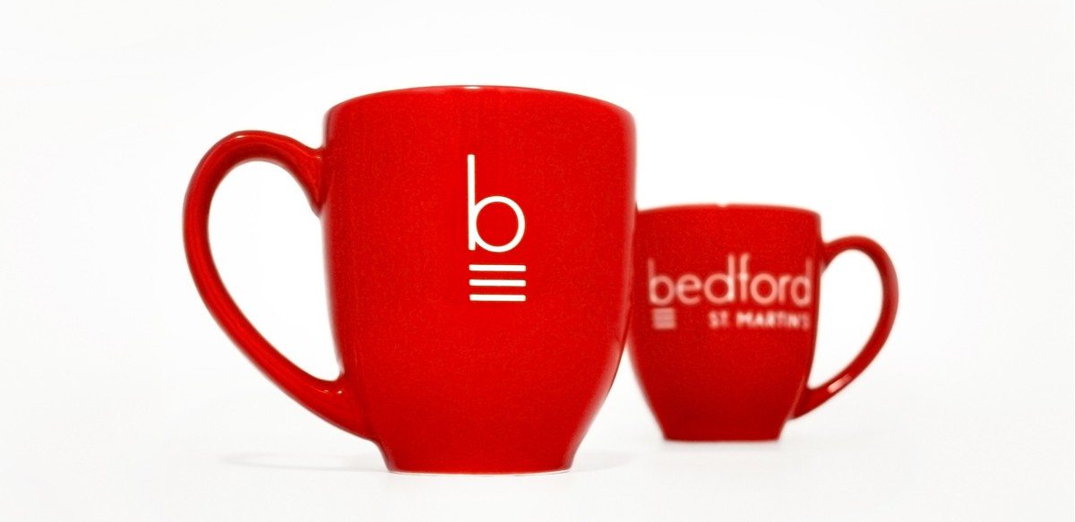
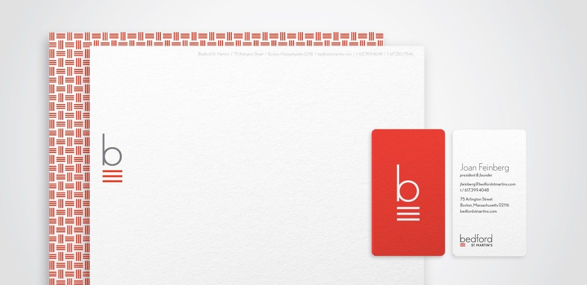
The identity includes the icon of the letter “b”, a simple typographic solution along with the additional meaning of the three underlines, a commonly-known proofreading mark for “capitalize”.
Scope
Brand Identity
Stationery
Product Design
Digital Communications
Art Direction