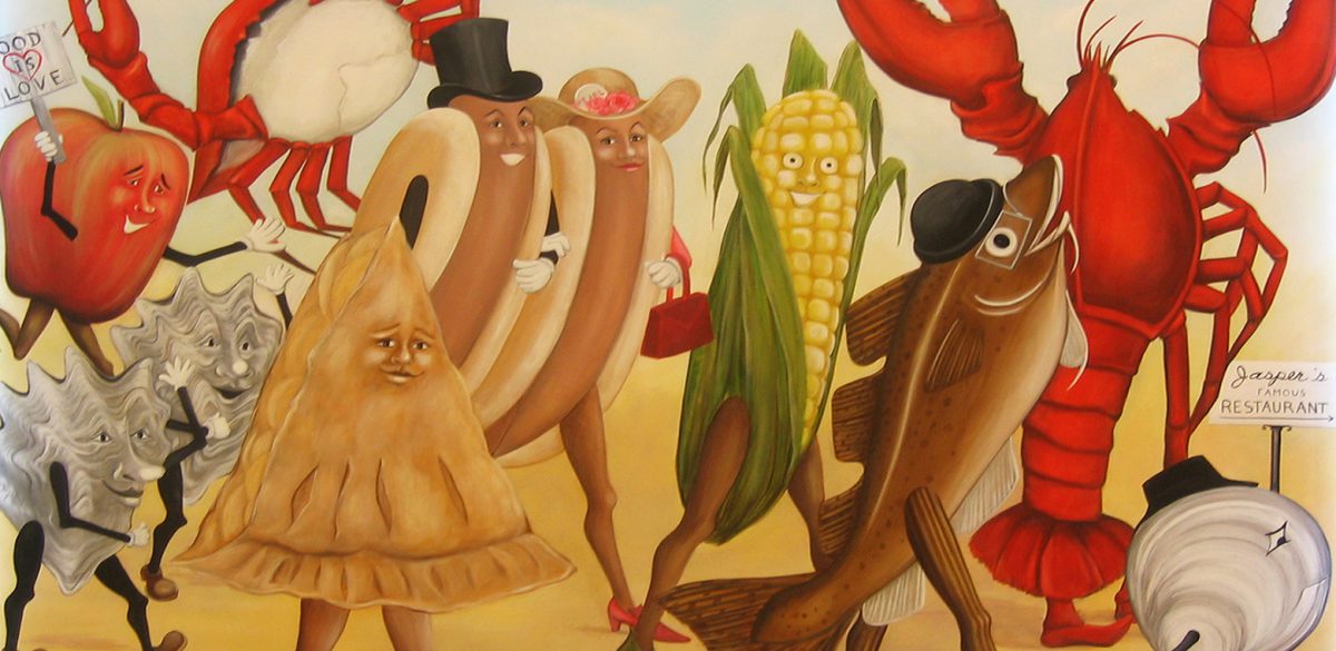
Food is Love.
The vision was to reinvent New England’s beloved classic summertime seafood shack, capturing the essence of the quintessential roadside experience and making it available all year round. What’s not to love? We had a lot of fun working with the dream team behind Summer Shack, Patrick Lyons, entertainment + restaurant renegade and Chef Jasper White, acclaimed restaurateur and seafood expert. Now that’s a lobster . . . and it’s not even our favorite thing on the menu!
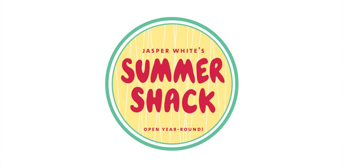
The “Food Is Love.” phrase was coined early on by Jasper while fleshing out of the concept and familiar – meets – iconic menu. At its core the ultra-casual ambiance of this “seafood shack on steroids” had to have great but simple food made from the heart.
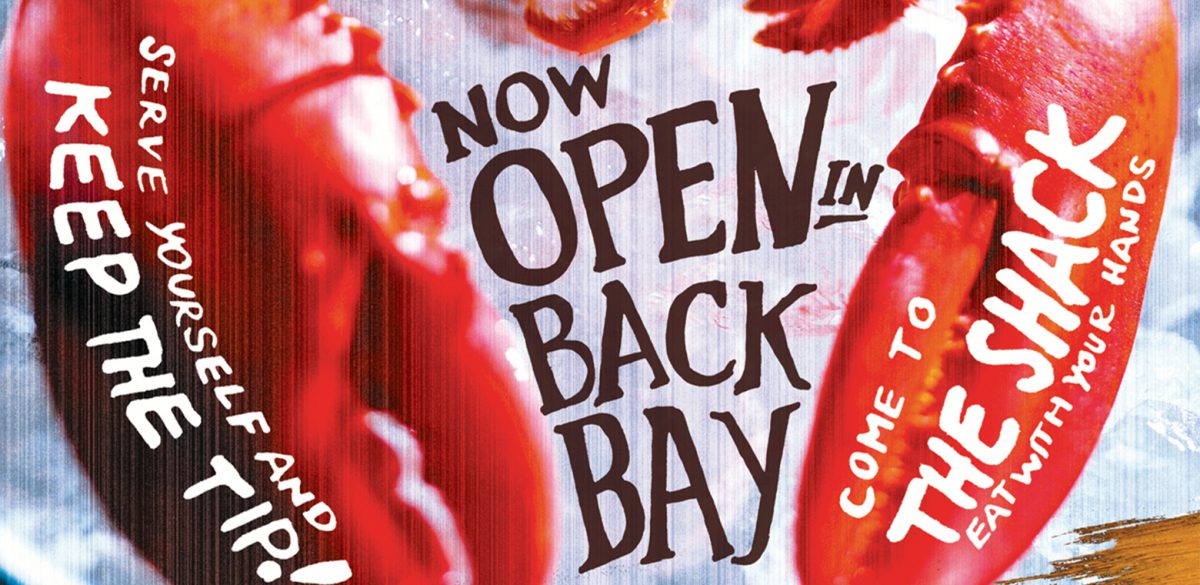
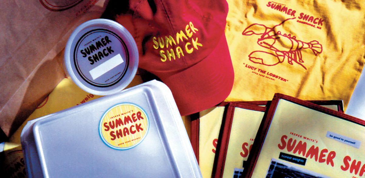
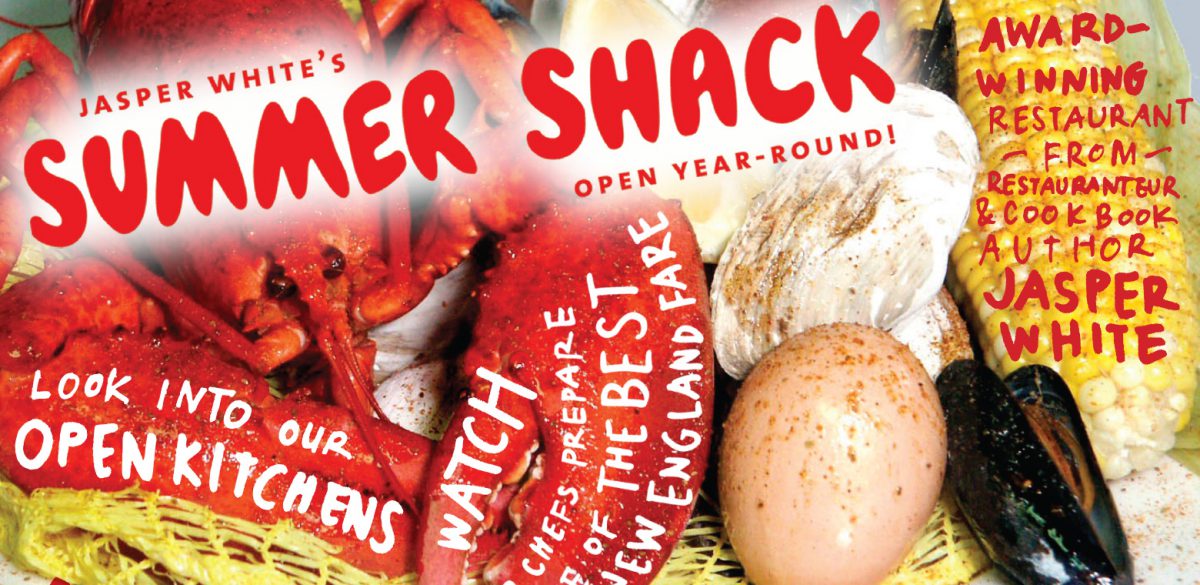
We wanted the entire expression of the Summer Shack brand to follow suit. Intent to capture the mom-and-pop aspect of the seasonal oceanside “seafood shacks” we used hand-lettered throughout, including the primary logo with its iconic red bubble-style lettering and spirited ad campaigns. We also cut and pasted and taped together the menu content, stationery elements, nothing was held precious or allowed to feel computer generated, The result is a timeless visual system that just feels right.
We are excited to share 25 pivotal projects, partnerships and creative moments with you over the next six months. Subscribe to our Newsletter to get monthly updates of our 25 years of projects. Follow us on Instagram to see more behind the scenes at Korn over the last 25 years!