Copyright

2015 – THE ENVOY HOTEL

This Way Forward

The ENVOY opened in 2015 as one of the first new developments in the now thriving Seaport. As an “envoy” or emissary of the creative and cutting-edge “innovation district,” The Envoy stands as a beacon for locals and travelers alike who are seeking what’s next. Drawing from the intriguingly intimate scale and siting – with tremendous views towards Boston’s skyline, the harbor and waterways – the brand evolved to embrace this optimistic new place and signal change, bringing a fresh point of view to evolving Boston. With its killer rooftop perch and location – from the get-go, The ENVOY earned its spot in every season.

Korn Design, working closely with client/ownership, Norwich Partners, and Group One Partners architects / interior design team, led the evolution of this property, pioneering an immersive brand experience true to the Envoy’s abiding watchwords, “This Way Forward.” Serving as both a rally cry for the creative community it hosts and the inspiring neighborhood it calls home, the Envoy embodied the trailblazing spirit of Boston’s newly coined “Innovation District.”

Optimistic and pioneering, the brand experience and the interiors design are in sync – speaking to materiality, simplicity and a play between the gritty, industrial texture of the active seaport and the shining glass, steel and polished surfaces of the building itself.

It’s apparent we had some fun with the brand identity: it’s purposely confident yet quirky – intentionally playful and handcrafted – and utilizes basic shapes as letterforms that nimbly twist and turn like innovative leaders in today’s world. Tipping its hat to technology, it’s inspired by both art and code and delivers multiple meanings. The warm yellow accent, distinct to The Envoy Hotel brand palette, dances throughout the environment, signage, guest rooms and amenities as a happy and positive pop that echoes the upbeat nature of the property, what it stands for, and who it serves.

Messaging is embedded in both grand and intimate scale into architectural elements, so that it may speak to visitors as they inhabit the hotel’s spaces: “This Way Forward” greets all who cross the hotel’s threshold, while “On The Way to Everywhere” is boldly carved into the lobby’s marble-clad walls. Floor-to-ceiling photographic seascape horizons provide the scene as guests travel upward in the elevators, cuing the constant ebb and flow of this place and its outward viewpoint.

In-room, the brand sings through sculptural objects such as the custom-designed TV bike stands and riveted luggage stools that carry messaging to marry form and function – in a room designed with the efficiency of a fabulous sailboat. The effect is much like being front-and-center on the bow with views that state this is the heart of the action, set on the glorious Boston harbor. The journey is made perfectly comfortable with accessories like thick fleece-lined sweatshirt-hooded robes, and a selection of local spirits, snacks and bath amenities from Boston-born Fresh.

The Envoy Hotel is wholly original. A gathering place for kindred spirits – and perfect for those who live out loud wherever it is they go . . . a gleaming light on the Boston horizon.

View Project >

We are excited to share 25 pivotal projects, partnerships and creative moments with you over the next six months. Subscribe to our Newsletter to get monthly updates of our 25 years of projects. Follow us on Instagram to see more behind the scenes at Korn over the last 25 years!

2012 – The Base

Success Lives Here

Loves runs deep when we talk about our work with Robert Lewis Jr. and The Base. It was just five years ago that The Base was launched in Roxbury with a mantra of “changing minds, lives and the status quo.” Born of the legacy of the Boston Astros baseball program that Robert began in Boston’s Villa Victoria public housing community in the 1970’s, ours was a small role in the dynamic vision of bringing The Base to life. Our primary hope: that we could craft a brand to do justice to The Base culture and deep spirit – most importantly create something these young people would be proud to wear to represent The Base, both on and off the field, serving, here in Boston and beyond. So we started there – asking the kids for their insights on what The Base means to them – and took it from there.. Success does live within each of us – this big takeaway proved that there was no one better to establish our strategic brief than the young people The Base empowers and serves.

In many ways, The Base is an evolution: of a baseball team, of a community, of a legendary mentor, and of the way we think about urban youth outreach in Boston and beyond. The Base is the new home of Robert Lewis Jr.’s Boston Astros, and a premier national urban youth training academy, which combines sports and academic opportunities to enable kids to develop athletically, academically, and altruistically.

Korn Design developed The Base’s visual identity with a passion to create a brand that would resonate with urban youth and mindfully represent a center of belief, hope, and love. We drew inspiration from a variety of youth cultures, especially in the immediate boldness of music, sports, and lifestyle brands. Then we got dirty and executed the mark with a language that reflects both the grittiness of the sport and the “grit” it takes to persevere and be great no matter what.

Robert Lewis chose to have a special “unveiling” of the new brand to the players at the field. On a glorious spring day, The Base brand was debuted, with the young people moved to see first-hand how their imprint was all over the outcome. Now celebrating its 5th anniversary, Korn is beyond proud of The Base, its amazing young people, and its leadership where it matters.

The Base’s Mission: The Base operates a premier national urban youth academy that combines sports and academic opportunities through a methodology that cultivates excellence, belief and love. We make the invisible, visible and shine a spotlight on the limitless potential of our young people. Learn more: thebase.org

View Project >

We are excited to share 25 pivotal projects, partnerships and creative moments with you over the next six months. Subscribe to our Newsletter to get monthly updates of our 25 years of projects. Follow us on Instagram to see more behind the scenes at Korn over the last 25 years!

2016 – PRUDENTIAL CENTER BACK BAY

Comeback in the Back Bay

In 2016, owner and developer Boston Properties asked Korn Design to refresh the Prudential’s visual identity system, in concert with the opening of a new building at 888 Boylston Street and an ambitious re-imagining of its retail and restaurant offerings. Fueled by the boundless energy of maverick EVP, Bryan Koop, his fantastic Marketing Director, Laura Marchisi Sesody, and their amazing team, we were determined to bring a meaningful underpinning to the new PRU brand identity that would both proudly represent this fully reimagined place in the heart of the Back Bay and celebrate it as a lifestyle destination and landmark.

An iconic part of the Boston skyline for over half a century – and a vibrant business, retail and dining hub in the heart of historic Back Bay, The Prudential Center project demanded an identity as impressive as the place itself. Drawing inspiration from the convergence of architectural patterns, shapes of the façade, and the changing shadows and shapes created by light shifting throughout the day, Korn designed a bold new logotype that visualizes this Boston icon through the angular cropping of custom-designed letterforms, hand-drawn by KORNStar and incredible typographer, Maggie Putnam.

Korn was also asked to conceptualize a method of launching the new brand as the complex underwent construction, to indicate that something exciting was evolving. In answer, we created a series of interchangeable patterns, inspired by signature architectural details of The Prudential Center, as well as architecture, fashion, and the movement of people within the physical space, which were translated at different scales as a series of overlapping panels and applied in dynamic and varied compositions as the construction progressed.

Still powerfully in play, the new visual identity captures the energy and excitement of the Prudential Center Back Bay as it evolves into its next century of influence. It is a perfect reflection of this new shining and dynamic place in the heart – and hearts – of Boston.

View Project >

We are excited to share 25 pivotal projects, partnerships and creative moments with you over the next six months. Subscribe to our Newsletter to get monthly updates of our 25 years of projects. Follow us on Instagram to see more behind the scenes at Korn over the last 25 years!
2013 – The Fenway Neighborhood

Now There Truly is “Never An Off Season”

Today, we can all agree that the Fenway neighborhood is a hot and exciting place to be anytime of day. In 2013, on the cusp of this massive development flow, Korn Design teamed up with real-estate developer and fearless creative Steve Samuels and his team at Samuels & Associates on one of the most “off-the-hook” placemaking assignments we could have imagined: to help to bring The Fenway to the forefront of people’s minds as a distinctive neighborhood when they are thinking about where to live, locate their office or simply relax. Our strategy– bring to light the tried and true vibrancy and eccentric character of this neighborhood and its residents to let the neighborhood speak for itself. Bordered on one side by Kenmore Square and The Charles River and on the other by the Fens and The Emerald Necklace, and powered by cutting edge music, entertainment, a kick-ass culinary scene, green spaces and fun, this is The Fenway that lived under the radar for decades. A neighborhood that will always be proud to call Fenway Park and The Red Sox neighbors, but not the only thing that defines it. Korn’s unconventional approach kicked into high gear with a guerilla messaging campaign, an aggregator website to give all the amazing residents a voice, and killer leading-edge partners in Isenberg Projects and Best Dressed Signs. The rest is history . . .

Our solution was a combination of zesty poster-wheat-pasting of the neighborhood with messaging around the Who, What and Where things are already happening, with “There’s Never An Off-Season” leading the charge. (Although completely environmentally-friendly, city officials’ didn’t like this component too much) The most recognizable and enduring component, the Fenway identity, was executed as a singular, connected mark, visually translating the many relationships throughout the area. The mark riffs on neon sign language to reference the around-the-clock nature of everything the neighborhood has to offer. The brand’s visual dimension and messaging wrapped everything from pedi-cabs to construction barricades and had a lively presence online with a vibrant social media strategy brought to life by our friend and creative partner, Isenberg Projects.

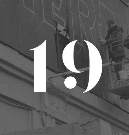
We expanded the typographic palette further when partnering with Best Dressed Signs to create a mural incorporating the phrase “There’s Never an Off Season.” Using the color palette in the identity, they interpreted the letters dimensionally to wrap the message in repeat around the building, which has since been razed to allow for the Samuels & Associates luxury residential project, The Point Boston.

View Project >

We are excited to share 25 pivotal projects, partnerships and creative moments with you over the next six months. Subscribe to our Newsletter to get monthly updates of our 25 years of projects. Follow us on Instagram to see more behind the scenes at Korn over the last 25 years!

2019 – Four Seasons Private Residences One Dalton Street, Boston

A Stunning Testament to This Great City

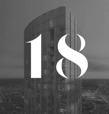
From nearly any vantage point, from miles away in all directions, you can spot the new Four Seasons Private Residences One Dalton Street, Boston ascending into the Boston skyline. It was a simple, yet brilliant, idea to colorfully light up the crane that we would all see throughout the duration of this significant construction – and shine a spotlight on the new Boston rising. For nearly 21 years we have been working closely – and trying to keep in step with – the visionary behind One Dalton, President and CEO Richard Friedman of Carpenter & Company, whose dynamic point of view and unique approach to all of his company’s developments makes for a great match with Korn’s dedication to fearlessly craft smart brand experiences that make a mark on the world stage.

This glorious architectural landmark, designed by the famed Harry Cobb of Pei Cobb Freed & Partners, in collaboration with Cambridge Seven Associates, will be the tallest residential tower in New England – defining the western end of Boston’s high spine. Working with Dick is always a “hands-on” experience, fueled with creativity and attention to detail. In the case of One Dalton, his personal connection and commitment to Boston, love of the city, and sincere loyalty to his friends and colleagues here and across the globe, ignited his passion to create something very special here. Overlooking and respectfully embracing its exceptional location in the Back Bay, the One Dalton brand and its story are elegant and graceful, yet powerful like the architecture itself – conveying throughout: there is only one, ONE DALTON.

Korn Design has a long history with Carpenter & Company, Cambridge Seven Associates and Campion & Company, and was engaged to work closely with this dynamic development and sales team to establish the communications strategy and create a vibrant suite of materials and touchpoints that bring the story of this magnificent project to life. We art-directed and collaborated with the talented team at 5SE to produce a property video that rings true with the project’s respectful and confident personality, narrated by no other than Dick Friedman himself, sharing this exceptional and unprecedented opportunity to live in these unique Private Residences, in Four Season’s style, and with the ultimate Four Seasons culture, service and amenities.

Boston has been waiting for this address to arrive.

View Project >

We are excited to share 25 pivotal projects, partnerships and creative moments with you over the next six months. Subscribe to our Newsletter to get monthly updates of our 25 years of projects. Follow us on Instagram to see more behind the scenes at Korn over the last 25 years!
RENAISSANCE IN “THE HUB”

BOSTON RISES WITH VIBRANCY, GRACE + HEART

Community sits at the core of all that we do, and have done, for over two decades. In this Issue #5 we focus our memories on our own backyard. Korn Design is proud to continue to champion the creative economy in our home town. We have been honored to work with extraordinary, incredibly smart, visionary, and bold leaders, clients, activists, artists, volunteers, teachers and young talent here in our community – together, celebrating the city we love.

2019 – Four Seasons Private Residences One Dalton Street, Boston: A Stunning Testament to This Great City
From nearly any vantage point, from miles away in all directions, you can spot the new Four Seasons Private Residences One Dalton Street, Boston ascending into the Boston skyline. It was a simple, yet brilliant, idea to colorfully light up the crane that we would all see throughout the duration of this significant construction – and shine a spotlight on the new Boston rising. For nearly 21 years we have been working closely – and trying to keep in step with – the visionary behind One Dalton, President and CEO Richard Friedman of Carpenter & Company, whose dynamic point of view and unique approach to all of his company’s developments makes for a great match with Korn’s dedication to fearlessly craft smart brand experiences that make a mark on the world stage. View Project >

2013 – The FENWAY Neighborhood: Now There Truly is “Never An Off Season”
Today, we can all agree that the Fenway neighborhood is a hot and exciting place to be anytime of day. In 2013, on the cusp of this massive development flow, Korn Design teamed up with real-estate developer and fearless creative Steve Samuels and his team at Samuels & Associates on one of the most “off-the-hook” placemaking assignments we could have imagined: to help to bring The Fenway to the forefront of people’s minds as a distinctive neighborhood when they are thinking about where to live, locate their office or simply relax. Our strategy– bring to light the tried and true vibrancy and eccentric character of this neighborhood and its residents to let the neighborhood speak for itself. Bordered on one side by Kenmore Square and The Charles River and on the other by the Fens and The Emerald Necklace, and powered by cutting edge music, entertainment, a kick-ass culinary scene, green spaces and fun, this is The Fenway that lived under the radar for decades. A neighborhood that will always be proud to call Fenway Park and The Red Sox neighbors, but not the only thing that defines it. Korn’s unconventional approach kicked into high gear with a guerilla messaging campaign, an aggregator website to give all the amazing residents a voice, and killer leading-edge partners in Isenberg Projects and Best Dressed Signs. The rest is history . . . View Project >

2016 – Prudential Center Back Bay: Comeback in the Back Bay
In 2016, owner and developer Boston Properties asked Korn Design to refresh the Prudential’s visual identity system, in concert with the opening of a new building at 888 Boylston Street and an ambitious re-imagining of its retail and restaurant offerings. Fueled by the boundless energy of maverick EVP, Bryan Koop, his fantastic Marketing Director, Laura Marchisi Sesody, and their amazing team, we were determined to bring a meaningful underpinning to the new PRU brand identity that would both proudly represent this fully reimagined place in the heart of the Back Bay and celebrate it as a lifestyle destination and landmark.
View Project >

2012 – The BASE: Hitting it Out of the Park
Love runs deep when we talk about our work with Robert Lewis Jr. and The Base. It was just five years ago that The Base was launched in Roxbury with a mantra of “changing minds, lives and the status quo.” Born of the legacy of the Boston Astros baseball program that Robert began in Boston’s Villa Victoria public housing community in the 1970’s, ours was a small role in the dynamic vision of bringing The Base to life. Our primary hope: that we could craft a brand to do justice to The Base culture and deep spirit – most importantly create something these young people would be proud to wear to represent The Base, both on and off the field, serving, here in Boston and beyond. So we started there – asking the kids for their insights on what The Base means to them – and took it from there. Success does live within each of us – this big takeaway proved that there was no one better to establish our strategic brief than the young people The Base empowers and serves. View Project >

2015 – ENVOY Hotel: This Way Forward
The ENVOY opened in 2015 as one of the first new developments in the now thriving Seaport. As an “envoy” or emissary of the creative and cutting-edge “innovation district,” The Envoy stands as a beacon for locals and travelers alike who are seeking what’s next. Drawing from the intriguingly intimate scale and siting – with tremendous views towards Boston’s skyline, the harbor and waterways – the brand evolved to embrace this optimistic new place and signal change, bringing a fresh point of view to evolving Boston. With its killer rooftop perch and location – from the get-go, The ENVOY earned its spot in every season.
View Project >

We are excited to share 25 pivotal projects, partnerships and creative moments with you over the next six months. Subscribe to our Newsletter to get monthly updates of our 25 years of projects. Follow us on Instagram to see more behind the scenes at Korn over the last 25 years!
Discover the power of a brave new brand.